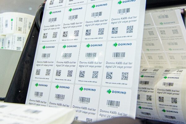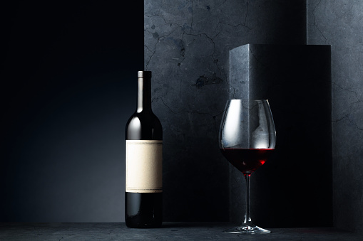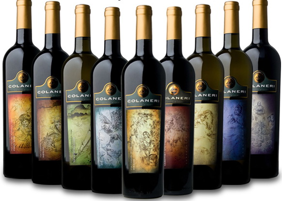

Wine labels are the first thing people see when buying a bottle of wine. From this, they get a sense of what kind of wine it is, where it comes from, and if it’s worth drinking.
There are many different ways to get your product noticed and sell more. One of the most effective ways is to use a good wine label design. A good wine label design can make your product stand out from the crowd and give it a unique selling point.
Good scratch label design helps you create an image that people will remember and associate with your brand. The best way to do this is by creating a clear image of your product’s quality and what kind of taste profile you want people to associate with it. You can achieve this by combining colour and typography with other elements such as images or pictures.
A good label design can help your product catch the attention of consumers, but it’s not easy to do well – especially if you’re new to wine labels! That’s why we’re here to help you make sure your design gets noticed.
Here’s how:
Make It Memorable: When people look at your label, they need to be able to tell exactly what it says without having to squint or read each word individually. That means using big, bold fonts that don’t require too much effort on their part (and making sure there are no typos).
Make It Brief: You want people to remember this information as quickly as possible so they remember your product while shopping for something else or trying something new.
Make It Simple: If you want someone to remember your name or brand name, then make sure that whatever information is on the label is easy for them to understand and remember! The same goes for if you have special offers or discounts going on at any point. The whole purpose of making wine labels is to make people go, “wow, this is so awesome! I can’t wait to try it!” If you’re not doing that, then what are you doing?
Not Using the Right Fonts: If you’re not already using it, you should use a custom font on all your labels. There are so many fonts out there that you can use, and they look great! The downside is that you’ll often find yourself going back and adding in more text than needed just because the font isn’t what you wanted to use.
When designing your scratch labels, the final thing to consider is how people will see it—visually and physically—when they pick up your wine bottle. It’s important not only for their own convenience but also because if they don’t like what they see when they hold it in their hands or smell it before buying, then there’s no reason for them to buy at all!
Suggest Read: Here Is All You Need to Take Care of Before Purchasing Wine Labels
Final Words
In summary, if your label meets all these criteria, it’ll be easier for people to remember the product and why they should buy it. Best of all, the design will help your product stand out from the crowd, so you’ll have an easier time attracting new customers.
Have any questions or comments about how to create labels? Let us know in the comments below.
